
Garmin and Coros disagree on the London Marathon – All the data

Key Points
- Terra Research analysed wearable data from 571 London Marathon 2026 finishers and found Garmin and Coros watches reported significantly different calorie burns on the same course: Garmin median 2,956 calories vs Coros 3,288 calories.
- The two brands agreed closely on average and max heart rate (around 163-164 bpm and 181-182 bpm) and GPS distance (both ~42.7 km, over by ~1.25%), with the overall median finish time at 3:55.
- Coros showed a 12% higher energy expenditure overall and a sharp 47% rise in calories per km for slower runners, unlike Garmin, which stayed close to the expected flat ~70 cal/km physiological benchmark.
- The gap likely stems from Coros algorithms over-weighting time on feet, causing unrealistic calorie accumulation on longer slower runs rather than true physiological differences.
- Runners should treat calorie readings as estimates, cross-check against rules like 1 cal/kg/km, and verify their device's model before using for fuelling or nutrition planning.
Terra Research analysed wearable data from 571 runners who completed the London Marathon on 26 April 2026, and the headline finding is that Garmin and Coros watches told two very different stories about the same race.
Terra is a health data company that connects wearables, fitness apps and medical devices to a single API, giving researchers and developers access to anonymised activity records across brands including Garmin, Coros, Polar, Apple, Fitbit and Whoop.
Its research arm publishes periodic studies drawn from that aggregated data, with the London Marathon analysis the latest in its marathon series.
The data shows Garmin runners burned a median 2,956 calories, while Coros runners burned 3,288 calories, a 332-calorie gap on the same 42.195-kilometre course.
The cohort split roughly 75% Garmin and 21% Coros, with a handful of Polars and other devices making up the remainder.
The study, authored by Alistair Brownlee, Cameron Crawford and Halvard Ramstad, drew on 921 raw activity uploads, filtered down to 571 verified marathon completions starting in Blackheath or Greenwich.
The sample skews faster and more tech savvy than the full 56,000 strong field, but it offers the clearest picture yet of where consumer wearables agree, and where they diverge sharply.
Where the watches agree
On the fundamentals, Garmin and Coros line up almost exactly.
Average heart rate came in at 164 bpm on Garmin and 163 bpm on Coros, a difference too small to be statistically meaningful.
Maximum heart rate followed the same pattern at 182 bpm and 181 bpm respectively.
GPS recorded distance was effectively identical at 42,734 metres on Garmin and 42,703 metres on Coros, both overshooting the actual course by roughly 1.25%.
The median runner across the whole cohort finished in three hours 55 minutes, with 54% going under four hours and 12% breaking three hours.
Watches across both brands recorded a median 42,722 metres, 527 metres further than the official course distance, with the slowest quartile over measuring by 309 metres more than the fastest quartile.
Where the watches disagree
The calorie gap is where the two brands part company.
Coros reported a median 12% more energy expenditure than Garmin, with a long right tail stretching past 5,000 calories for some runners.
Terra plotted calories per kilometre against finish time band to test which estimate matched physiology, and the results show a different story.
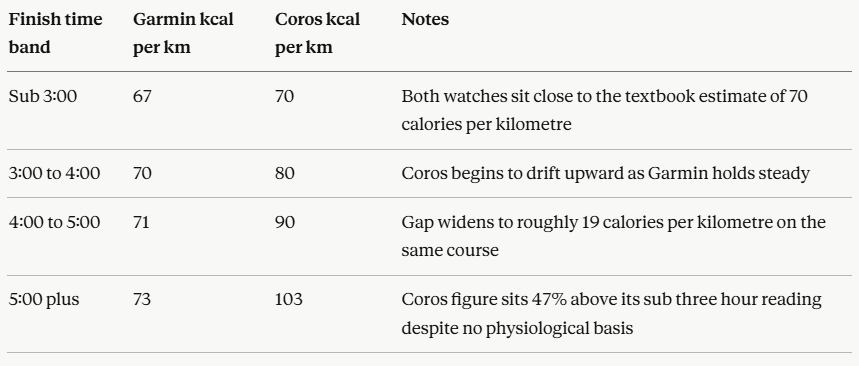
The textbook physiological estimate sits at roughly 70 calories per kilometre for a 70-kilogram runner, largely independent of pace.
Garmin tracked that benchmark almost exactly across every finish time band, drifting only from 67 to 73 calories per kilometre between the fastest and slowest runners.

Coros bent sharply upward, reporting a 47% increase in energy cost per kilometre as runners slowed down, a pattern that physiology does not support.
Why does the gap exist?
The Coros algorithm appears to weigh time on feet heavily, accumulating calories through the extra hours that slower runners spend on the course.
A runner taking six hours instead of three logs double the elevated heart rate readings and double the walking sections at aid stations, and the Coros model keeps adding calories at a rate that is mechanically difficult to justify.
Running a kilometre slowly does cost slightly more than running it quickly, but not 47% more.
Terra flagged one caveat: user weight, sex and age were missing from the export, so the Coros cohort could in principle be heavier on average.
However, a uniform demographic difference would shift the Coros line up by a constant amount rather than bend it upward with finish time, pointing the finger at the algorithm rather than the population.
What does it mean for runners?
Calorie figures from a wearable are a model output, not a measurement, and the slower a runner goes, the further that model can drift from physiology.
Terra suggests calories per kilometre should be roughly flat across finish time bands on the same course on the same day, a self-contained plausibility check that does not require lab reference data.
For runners using these figures to inform fuelling, recovery nutrition or weight management, the device on the wrist materially changes the answer.
A six-hour Coros marathon suggests the runner burned over 5,000 calories in some cases, while a Garmin on the same wrist on the same day would report closer to 3,000.
What runners should do next:
- Check which calorie model their watch uses before relying on the figure for nutrition planning.
- Compare calories per kilometre across runs of different paces to spot algorithmic drift
- Treat any single watch reading as an estimate, not a measurement, particularly on long efforts.
- Cross-reference with physiological rules of thumb, around one calorie per kilogram per kilometre, for a sanity check.
Read the full Terra Research report here for the underlying figures and methodology.